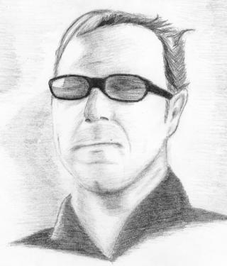
 Kevin Spacey as Prot (K-Pax [2001]) Kevin Spacey from the cover of the K-Pax CD (music by Ed Shearmur). This was drawn the day after the Danny Elfman picture that I screwed up, and in contrast to that image I was very happy with how this one turned out. My biggest regret was where I positioned the thing on the paper—I keep telling myself that I’m just going after the image and that I’m just practicing to get a feel for drawing real faces, real facial features—but at the same time there’s a nagging voice saying, “why not practice framing the composition at the same time, nit-wit?” Especially since full-frame composition is more difficult than simply “I’ll just drop this image in there”—everything has to be proportional to all the other elements, at the correct angle in relation to the other elements and the viewer, on top of structure, focal points (the list goes on and on.) I like the original image for its placement of highlights on either side of the face as opposed to light directly in the center. It’s one of my favorite lighting styles, and, in fact, I’ve experimented with it for a few other images on this site (Kadessa and Hell Hunter.) I like it because most photographs want to keep the face as illuminated as possible without washing out the features, but to me that’s not as interesting—it’s too typical. This is different. Film noir-ish. And I’m glad that the artist who designed the K-Pax cover designed the lighting the way he did. I just feel that shadows down the center of the face create more interesting shapes as opposed to its inverse. I left the image unblended, keeping all the pencil strokes visible. It really wasn’t an aesthetic decision, either; coming out of an epic screw up with blending in my previous drawing, I was trying very hard to avoid a repeat. Other than a few minor complaints (the hair, a few missed highlights on the glasses, misshapen nose, minor proportion issues around the mouth and chin) I was happy with this one. Also Available: Kevin Spacey, Take Two |
|
|
