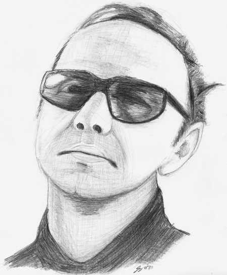
 Kevin Spacey as Prot (K-Pax [2001]) I apparently never put a date on my first render of the K-Pax Soundtrack cover, but, making an educated guess, I'd say it was done around 2003. This time around, here in 2011, I did not draw from the physical CD booklet as those are all nicely packed away in a box thanks to the invention of the iPod which houses my entire CD library (man, do I feel old). Instead, I drew from an image I pulled up either from IMDb or a google image search (either way, I got the exact same image only in electronic form) and drew from the computer screen. No warm ups, and it was drawn upside down. Looking back at my original render, it strikes me as "painfully generic" (to borrow the phrasing from the Stan Winston, Take Two update) and I'll go even further adding the original drawing looks extremely stiff (almost like a bust statue.) The newer drawing, by contrast, looks much more detailed and much more human—particularly, the tilt of the head which is completely missing in the original (and, as a result, that Kevin Spacey looks like the terminator.) It never ceases to amaze me how a single detail can carry so much weight and meaning— that that slight head tilt conveys a sense of a whimsical daydream, which if you've seen K-Pax, you know Prot (Mr. Spacey's character) lives in his own bubble and for the most part seems happy in there. The updated render is much larger, filling up the page much better, and captures much more subtle details which make the face more recognizeable and more unique. The rounder face (the original was drawn much too narrow); the proportions of all the features, while not perfect, better represent the source (in the original the glasses are too small, not the right shape, and the upper lipe and chin looks much too tall); the highlight on the glasses extendes to the rims this time; and the shirt collar (while still off) is at least in the general ball park of the correct type of collar it's supposed to be. Still, it has a few issues. Most glaring to me being the mouth and chin aren't quite in alignment with the nose up. Glasses aren't quite the right shape (not to mention I should have used longer cleaner strokes shading them), the hairline (frame right) isn't right, and the mechanical pencil lead kept breaking which made me quit shading prematurely so the shirt is nowhere near where it needs to be quality wise. All things considered, though, it shows a significant improvement over the original (and eight years later, it damn well should!) And, once again, like the Stan Winston update, I think this new drawing speaks more for itself than this commentary (especially juxtaposed to the old render.) Also Available: Kevin Spacey, Take One |
|
|
