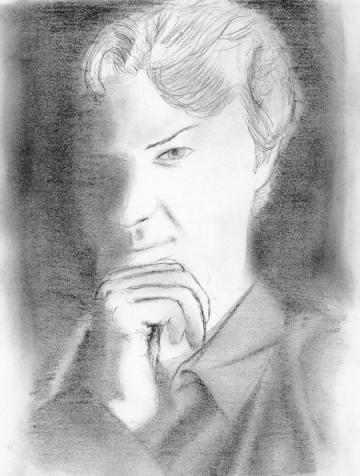
 Danny Elfman (Composer) So one day I’m sitting there, half-debating on whether I should do some work on one of the five-billion drawings I promised my friend Mark for his site or develop an image that’s been brewing in my mind. Both images I’ve worked on and tweaked (etc) in the past, but I can never get even the rough sketches to look remotely decent. Why not? Because I am not an illustrator. The intelligent thing to do in art is draw from real life (or mimic other artist’s work), get a good feel for drawing these subjects and then do illustrations. So, I decided to do the intelligent thing, which lead to another problem—since I’m now going to draw from real life (ie real people) ... how am I going to pull this off without hiring models (because I can’t afford models ...) As I’m sitting there pondering this, low and behold I have one of my many soundtrack CDs sitting there staring at me, the booklet showcasing various scenes from the film. With that said, this picture is actually not from a soundtrack (still from a CD, but not a soundtrack.) Composer Danny Elfman from one of his Boingo albums, Dark at the End of the Tunnel. I liked the photograph for its dark style—how most of his face was shrouded in shadows, and I wanted to really translate that into my drawing because it matched the style of an illustration that I’d tried already (and failed miserably at rendering, I might add.) Unfortunately for me, though, this was the very first picture I’d drawn in a long long time, and like every time when I pick up a pencil after over a month of rest I always forget about little rules and tricks and stuff until it’s too late. So, yeah, I can’t stand this render of Danny Elfman. Just the nature of the lighting in the original photograph gave it this high contrast from the lit to unlit areas (translation: very little gradient shading—it’s either black or white.) When working with something like that, it proves more difficult than one would think since a whole slew of subtleties convey the information—information most people can’t consciously pick up, but just know when it’s not there. I needed more shading; even if it is barely visible, that little bit makes the difference between a flat surface and a curvature. On the topic of screw ups—did I ever botched the blending of pencil strokes in the shadows (the image has been cropped to eliminate the really screwed up stuff). I wanted it to look smooth and stroke-free ... instead I wound up with semi-abstract art (okay, very abstract art). Oh well, it was my first run. Hopefully I will revisit this image again and do it right. Also available: Danny Elfman, Take Two |
|
|
