|
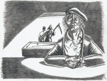
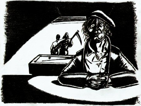
I wanted to draw a look of disbelief, a look of horror, the look of a man caught in God’s headlights who, when his eyes adjust to the brightness, notices the Almighty is giving him the finger. A bar seemed an appropriate setting, so I started out drawing the figure sitting at a counter with a glass in his hand (sans background). The actual background came later; I knew it’d be bar related, but I didn’t know if I’d go with a pool table, table and chairs, a booth, or maybe some nonsensical alternate reality. Even though foreground and background were conceived seperately, I did deliberately position my character off to the side so I could later develop his reason for the horrified expression. Or to phrase another way: I planned the positions even if I didn’t plan the details (you can tell because the focal points aren’t quite where they need to be for a balanced asymmetrical render.) You know what? Maybe planned is too strong a word. This visual setup—character in foreground with funny expression on his face, reason for said expression in background behind him—is pretty classic (cliché, maybe?) Kind of the still shot equivalent to a movie showing something then cutting to the character’s reaction. But, hey, it works, and I like it regardless. I also wanted to experiment with non-gradient black and white shading (well, as far as pencil will allow me to, anyway.) Full confession: I rendered this image during the same timeframe as A Gentleman and Dragon’s Pet (started it last, finished it first) and I did not feel like doing another detailed background. Hard black and white let me simplify the image with two pools of light. The handful of items visible implicitly describes the rest of the scene, letting the viewer imagine that dark bar so I don’t have to draw it. Ink, paint, or even charcoal caters better to the two-color renders, but, I figure I should get comfortable in the medium I’m most familiar with before adopting new tools. Especially since I can get a fair feel for how this image would look in two colors via electronic manipulation (as shown), and see if there’s any shape/line issues (with no shades of grey, all you have are lines and shapes, and if you screw one up ...). I’m happy to observe that most of the details come through in two colors, and all the main points maintain their clarity. Granted, I could have spent more time in Paint Shop Pro stripping out the pencil strokes for solid black and white, but, polish really wasn’t the point. It was meant to be an experiment, maybe a segue into something else. I’ll give those projects their due time, hopefully in another medium. And I’m definitely going to have to start using a straight edge because, dammit, non-straight lines that are supposed to be straight are starting to bug the hell out of me. |
|
|


