|
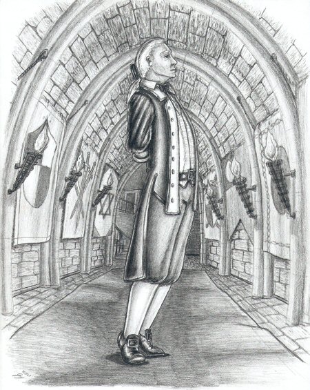
“If variety is the spice of life, then marriage is the big can of leftover spam.” Easily my best composed and best executed drawing to date (not to mention the most convincing perspective I’ve ever drawn.) Many inspirations here. Sometimes when I doodle, I’ll listen to streamed video from the Daily Show, Colbert Report, Morning Joe, or the Late Show. So while working on an uninspired doodle during David Letterman’s monologue, I happened to glance up at the screen to see Mr. Letterman go up on his tiptoes for a second—something his mentor, Johnny Carson, used to do (in addition to his trademark golf swing.) “Huh,” I said, putting away the doodle and breaking out a fresh piece of paper, “I kinda like that.” So, I set out to draw a male figure rising to his tiptoes ala Carson/Letterman mid-joke, but I didn’t feel like drawing either men; I didn’t feel like tracking down an appropriate photo—I was more concerned with the pose than resemblance to anyone, and ... I hate drawing modern suits. After laying down the initial linework for the general pose, I faced the task of filling out details. With Stanley Kubrick’s Barry Lyndon still fresh in my mind (this was started around the time I drew by Candlelight), I decided on an 18th century Gentleman (back when male attire had flair and style.) For the background, I wanted something that recedes a good distance as I’ve been itching to tackle perspective which is, in my opinion, my weakest point. Given the figure in the foreground, I immediately thought of a corridor, so I laid down the initial lines for the arches and then I started thinking of all the things I’d need to fill in the space to make it look right—bricks, maybe torches or candles, banners, chandeliers, carpets, tapestries ... and the more I thought about it, about how much work it’d be, I seriously thought about erasing it and leaving the image just a figure floating in negative space. Even did a round of shading on the figure before finally convincing myself to continue with the setting. Developing the background was, quite literally, like filling out one of those old Mad Libs. I knew I wanted a corridor, but I had no idea what I wanted at the end of the corridor; thus, I left it blank for the longest time. I knew I wanted banners, but had no idea what designs I wanted on said banners; so, I drew rectangular shapes and left them blank. I knew I wanted arches, so I drew their outline but left their details blanks. At one point, this image was basically a detailed figure standing amidst a series of brick patterns with oddly placed blank spots. As the shading on the bricks evolved with emerging texture and the light patterns from the torches, I slowly filled in the details of the distant room, of each of the banners, of the archways. Slowly unifying the image. Slowly finishing that damn background where I spent probably 75-80% of my time, shading, re-shading, redoing lines, shading again. I think the efforts paid off. Again, from a purely mechanic perspective, this is the best I’ve done ... even if it’s not the most interesting drawing from a conceptual point of view (Dragon’s Pet wins in that department). Still, this Gentleman resonates with a more classical and archetypal feel, and there’s a certain charm to old school symmetrical imagery. |
|
|

