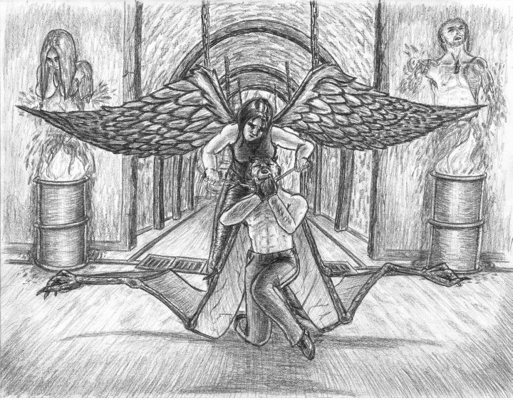
 The Dark-winged Angel For awhile now, I’ve been meaning to revisit Hell Hunter. Maybe take a second crack at it or do a sequel or ... I dunno. Well, time went on, and nothing ever seemed to come of it. I started one drawing that featured an angel in a cemetery, and I liked what I had going. Was putting the final touches on the shading, and ... one microscopic dot of sticky chocolate syrup from my drink got on the side of my pinky, and even though I washed my hands before setting down to draw it somehow stayed there. Left a teeny-tiny spec on the page. No one but me would’ve noticed it, but it still pissed me off. Fast forward several months, and the inspiration strikes to finally do Hell Hunter 2, taking some ideas from that original angel drawing (the black wings) and incorporating them here. I wanted to do a complete reversal of the original drawing—instead of a demon slaying an angel in a church-like setting, I went with an angel slaying a demon in a cult-ish dungeon. Typical of many of my doodles, the drawing was designed more or less as it was rendered. I believe I started with the demon’s body first, then moved on to the angel’s as they are the center of the action. Originally the demon was setting on both of his knees, but I wanted to move away from generalized symbolic poses and move more in the direction of a realistic dynamic struggle as though he were trying to fight, trying to stand, but succumbing to the weakness of asphyxiation. Never was entirely happy with it, but I didn’t want to push my luck with more experimentation. After awhile, I also realized the angel’s hands should be twisted more at an angle to give her more leverage (should’ve better defined the rope too, while I’m being nitpicky.) The wings of both came later. I knew I wanted them to be parallels of the original wings, with her's being shiny-black to once again command attention. While I like how the angel's black sheen feathers came out, I'm far from satisfied with the demon's wings. I wanted them to be more complex and more full (like the original); however, the initial lines were too confusing for me to keep track of. I soon realized, the level of detail and complexity that I wanted coupled with their folded up/crumpled position was just way over my head (for a first crack, anyway). So, I thinned them out and heavily simplified them. It's passable, but they're still way too narrow. On the plus side, though not quite intended, I like how the general shapes of the two pairs of wings mirror one another. The background is purely improvised, and not even the disturbing imagery of severed torsos can hide the generic “long corridor” background I’ve done a few times. I really should have gone with a low angle and asymmetrical frame. Feels like I’ve been here before and done this already ... that, and it really really bothers me that you can’t see the top of the closest arch-way (it just flings the viewer’s eye right out of the picture.) *sigh* Anyway, obligatory comparisons: I like that this one is more comic-book-ish in its shading versus the more realistic approach of the first. I feel the craftsmanship of The Dark-winged Angel far surpasses the original (in ten years, I damn well better have learned something); however, in terms of framing, ideas, and details I think the original still outshines its successor. But, then again, number two was completed from conception to finished product in a fraction of the time; it had none of the planning of the original, had no rough sketches leading up to it, and no warm-ups. I bet if I took the time, worked out the details, drew from source material like the original, and gone with the a low asymmetrical angle it would easily blow the original out of the water. Hmmm ... Also Available: Hell Hunter. |
|
|
