|
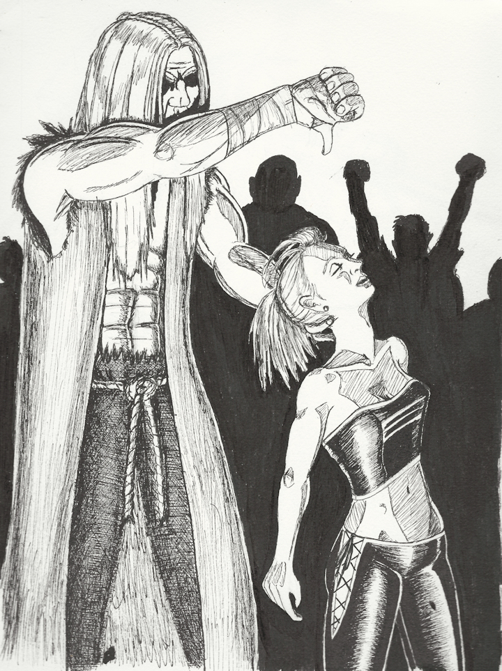
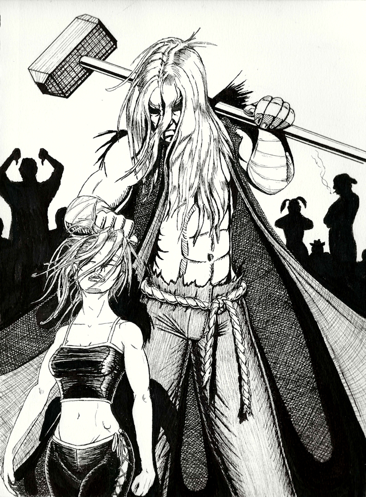
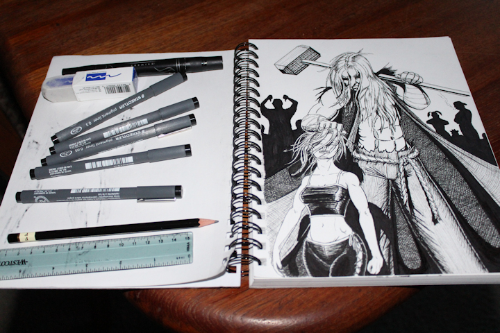
Technical CommentaryEven though I haven’t uploaded anything, I’ve been working with inks since mid-2013, spending much of that time reading How To’s, acquiring tools/materials, experimenting, working out beginner kinks, and developing my process/style. And while I have tackled a number of different media—brushes, dip pens, and fountain pens—I tend to rely on technical pens and markers more often than not purely for convenience. The Champion and its prototype (below) were both rendered with a Koh-I-Noor F pencil, Prismacolor marker with a brush-like tip, and a set of Staedtler technical pens. Unfortunately, not many technical pens or markers achieve true black although, in fairness, not all waterproof ink or fountain pens make it there either. So I tweaked the brightness/contrast for the final render to give it a comic book feel, which the publishing process does anyway to eliminate things like visible brush strokes; however, in the interest of full disclosure, I left the prototype untouched so you can get an idea of what it looked like before. For the longest time, I would leave the pencils in a rough line-only state and figure out the placement of shadows once I’d broken out the inking tools; however, that changed during this time frame while working on another project. You see, with inks, you can’t exactly erase as easily as you can with pencils, so I faced a bit of a dilemma when it came time to render the black shadows and shades of gray. Specifically: where to put the black shadows and how to get gray out of a tool that only yields black. So, more and more I started looking at comic books for guidance, and in my research I found some helpful behind the scenes panels in a pencil-only state, fully shaded. “That’s right,” I remembered, “I can shade this in pencil, tweak it to my heart’s content, and get a feel for how it’ll look, then ink it.” And let me add, “Duh!” In my defense, though, because of time constraints, I always just skipped the pencil cleanup and shading because it seemed like an unnecessary step since I was never handing my sketches off to someone else, but never underestimate the power to confuse yourself and/or forget crap. So that takes care of the solid black, but I still didn’t know how to go about getting grayscale. At one point I scanned it in and considered doing some electronic testing to get a feel for what I wanted, but that never really came about because I never really had a good way to do any testing. You see, it’s not that I didn’t know what I wanted—I wanted hatching and crosshatching—I just wasn’t sure how to do it. I mean, yeah, I know about the technique. I know what it is. And in a shallow sense, I know how to do it ... but I really don’t know how to use it. One of my sketchpads is full of ink drawings where I used a 0.05mm pen and shaded like a pencil which, by the way, you can see in the champion’s cloak in the prototype below. I knew I wanted to get away from that and do crosshatching. Real crosshatching. Because I’m not comfortable with it. Because I’m not good at it. Because when I try to use it, it never looks right, so I add layers and layers and complicate it just like a novice artist afraid of compositional simplicity. “Throw the kitchen sink at it! The viewer will get distracted and never realize I’m a hack with no control over focal points!” Then my fear of solid black came back to haunt me. Yes, preliminary pencil shading helped me lay down some black with confidence when I still had large regions of white paper showing (mostly in the Challenger’s outfit because, with the blacks around her, I didn’t want to lose one of my main focal points), but I didn’t realize how paranoid I’d become until running across a passage in Klaus Janson’s book, The DC Comics Guide to Inking explaining that the goal of a comic book artist is not to use his tools to imitate life, but rather to serve the composition. A light bulb went off, and I realized I had been obsessing over logistical minutia. And you know what? None of it mattered. None. This set off a chain reaction as I then remembered the Wallace Wood quote, “when in doubt, black it out.” Deep dark uncompromising blackness is the whole point of using inks, and too little does just as much damage as too much. Black gives the objects and figures their shape, their weight, and their energy; it guides the viewer’s eye from focal point to focal point. You can’t be afraid of it. But I was afraid. And because I feared it, I’m still going back and adding more even as I write this commentary. And each and every time I use black, the image gets better.  The Prototype. (Click to enlarge; double-click to restore.) Now, I did not set out to do a prototype. I set out to do a finished product; however, early in the process—very early in the process—it became clear that I did not give my figures enough space. I wanted the hammer in frame, I wanted it over the bad guy’s shoulder, and apparently I wasn’t thinking because I put him at the very edge of the page. When roughing out the figure, I tend to draw the head, the torso, the legs, and then the arms. Not fully fleshed out figures, mind you, but something more advanced than stick figures. Regardless, since arms are what we use to handle things and arms are the last on the list, it didn’t click until I had two mostly completed human bodies sketched out. I could have fixed it if I really wanted to—it was still early enough to erase and start over—but for no particular reason, I decided to continue anyway. “Who knows? I’ll come up with something else for him to do, and maybe I’ll like that more.” I didn’t. However, I did learn a lot from just seeing it through, and I learned even more putting the two side by side. First and foremost, while she looks okay, Jesus Christ does he look rigid and stiff. And coincidentally, it was in the Challenger II commentary where I talked about the human figure not being a pillar ... and here I drew a human pillar. Much of this has to do with how I intended to draw the Champion versus how I actually drew him. The shoulders and torso have a degree of flexibility—shoulders can be pushed forward or back, and the torso can twist. Hold out your arm for a thumbs down. Notice your shoulder comes forward. Now try reaching even further forward as far as you can without leaving the chair (or moving your feet for you weirdos reading this standing up.) Notice now your whole torso comes forwards, twisting as you stretch. That is not what I drew. Now, with your hand still outstretched, try to push your shoulder back as far as it will go. Feels unnatural doesn’t it? Counterintuitive to the point of being uncomfortable as if one completely defeats the purpose of the other and your body is fighting itself. That is what I drew. Why? Well, go get something long and narrow to simulate the handle of the sledgehammer and rest it over your shoulder. Is your shoulder pulled forward or pushed back? Like I said, I drew the shoulder position of one pose and fused it with the arm position of the other, and the two do not go together. There is a number of ways I could get the thumbs down to work, all of them involve changing pretty much everything from the ground up. But, frankly, it just doesn’t feel right for this brute. Even cupping the back of her head which I did deliberately to be different (a gentle touch to present the fragile remains of his shattered porcelain adversary) just doesn’t feel right. Not for him. He’s a vicious savage. He doesn’t care about her. He doesn’t care about the crowd. He doesn’t care about sophisticated things like irony. All he knows and understands is blood, broken bones, and pain—that’s why I gave him a hammer, the biggest, bluntest, smashy-est weapon of them all. Weakness disgusts him. In the final version, he’s holding her up solely to see if she has any fight left in her. And if she is, indeed, finished ... ... then she is, indeed, finished. Back to the technical details: while I think the Challenger looks decent, I could have done better. For one, I prematurely erased all the pencil after getting the initial outlines inked, and then I realized those pencil marks would be handy when inking the shading which lead to a paradoxically subtle yet major screw up. Follow the line of her back. It is arched. Now look at the surface plane of her stomach. It is not arched. If you look at the crotch of her pants, you’ll notice a highlight where the centerline of her abdomen should meet up but doesn’t. Remember what I said earlier about confusing yourself and forgetting about things? This is exactly what I was talking about. Two, when the human back arches, the lower rungs of the ribcage become very prominent, and the upper abdomen actually hollows out as it stretches. And three, her arm does not look limp and lifeless like an unconscious and/or dead person’s arm would be. That is because I drew the elbow straight, and elbows naturally bend even in a neutral position. Plus, if you look at her forearm, it is not perpendicular with the ground as gravity would have it. It doesn’t even look like it’s in motion from being roughly handled by a violent conqueror. It looks like she’s making a deliberate effort to keep it at that -1° angle which she should not be able to do as a ragdoll or corpse. I did like the lighting from below which produces a more menacing set of shadows. I’m not entirely sure why I abandoned that idea either. At the time, I may have been worried about the Challenger casting inky black shadows on the Champion and losing them both to the background. Or maybe it’s because I couldn’t find a heavily crosshatched attractive female in my research, and I wasn’t crazy about my own results.
—Jay Wilson Also available: Concept Commentary |
|
|


