|
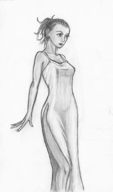
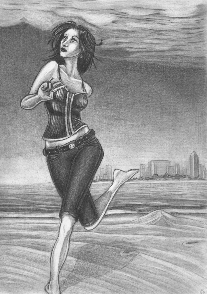
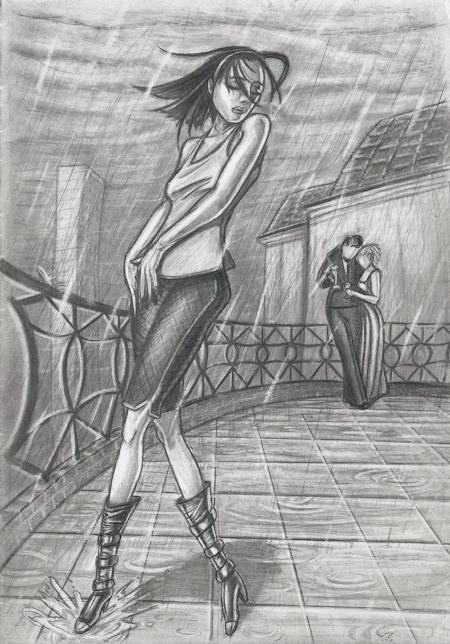
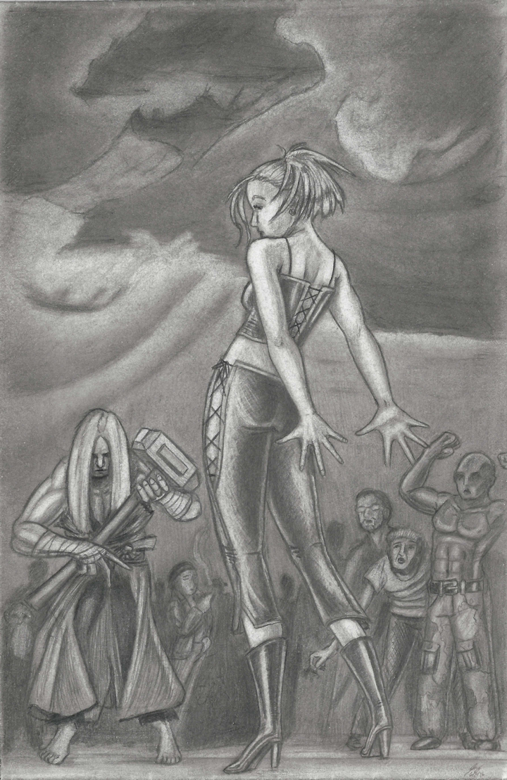
Three doodles (not counting White Silk1 below). Same story. At work, during lunch or after hours waiting for traffic to die down, I would doodle on plotter paper with mechanical pencils; I would get to a certain point and stick them in a drawer; and there they would stay for months and months. Beyond that, these three doodles share a desire to explore more dynamic poses. You see, I fell into a bit of a rut drawing straight-on static figures just standing there or straight-on static faces in a neutral emotionless position. You know, novice artist “learn how to draw” crap. Part of the reason was I didn’t have much time to draw which meant I had even less time to plan or think about a composition. Work got so (artificially) busy it was Paper + Pencil = Draw. Who cares what? Just draw to keep my sanity. ... but I couldn’t keep my sanity that way. It was artistic autopilot.  White Silk1. So I picked up my pencil, and decided it was time to challenge myself and evolve. Like most artists, I followed the logical progression of learning basic proportions followed up by specific details of bone and muscle structure, during which time the poses are more simplistic, mechanical, and stiff although every once in a while a render would rise above my average ability and achieve an organic naturalness. So now I wanted to focus on movement and nuance—a dynamic figure with energy and grace—yet at the same time having a sense of weight. Weight. One of the elusive je ne sais quoi’s of art. In terms of figure drawing, that requires an understanding of how the muscles and bones counteract gravity because a sheet of paper does not have its own laws of physics. Weight is an illusion the same way depth is an illusion on a flat page. Muscles have two states: contracted and relaxed which changes their shapes—the bulges, the valleys, the highlights and shadows. Then there’s the bones that can have radically different positions which introduces its own little universe of possibilities. While I’m tempted to say that most of the figure’s sense of weight is in how you render the feet ... that’s really not true, and it’s a common mistake we studying artists often make. The feet, in a standing figure, are critical because they are the point of contact with the ground, and of course the legs distribute much of the weight and support the rest of the body—let’s not gloss over that. However, balance comes from the entire body. It’s one of the reasons we have arms. It’s the reason why our limbs are connected via ball and socket joints and why the forearms and shins have two bones and not one (not to mention the multitude of bones in the wrist and ankles). It’s also one of the reasons our backbone is composed of individual vertebrae. Because we can stand upright, we need all of that to maintain our balance in the infinite number of positions the bipedal human form can assume. So, yes, an artist has to know how all the joints can move—that’s the easy part—but also how they actually move under the force of gravity in relationship with other joints to create equilibrium. That, my friends, restricts the total number of configurations—still an overwhelmingly vast number—but a restricted number, none-the-less. For example, when you run, which arm swings forward with which leg? Answer: unless forced otherwise, arms and legs work opposite each other. But that’s not enough. How far do the arms swing? How high up do the knees come? What angle is the foot tilted at? How far forward does the body lean to compensate for speed and momentum? These are the kind of questions I wanted to explore with these renders.  A Run on the Beach. With A Run on the Beach, I really wanted to capture a run with wonderment. Not a full on sprint. Not an escape. No thrills nor intensity. I wanted more a lover running parallel with her fiancee’s train bidding him a safe journey type run, perhaps even a bit of whimsy because she knows she can’t keep pace. Or perhaps she’s arriving on new shores and running with no direction nor destination in mind, just seeing more of this new exotic landscape so her speed is tempered by her desire to take in her surroundings. In other words, I wanted her to “run”, not “RUN!” And the paradoxical thing is, that aspect of my intent was captured perfectly even if the figure itself is flawed. Her left foot clearly twists too far (not to mention drops out of frame), her right leg doesn’t quite kick up at the correct angle (although, I kinda like it that way), her right forearm isnt properly foreshortened (really could have used a reference), and it’s always bugged me that her left arm isn’t visible, but at the same time I could never bring it into view naturally. However, I was very happy with the flow and rhythm of the pose, the opposing angles of the shoulder and hips which distributes weight and balances the figure, the slight twist in her torso which gives her a sense of energy and movement, and I’m pleased with how her hair swirls around like she was looking another direction and just turned her head suddenly. I’d even go so far as to say it’s my favorite of the three. As for the background, I really didn’t know what I was doing especially in regards to the sand in the foreground. I literally do not know how to render that, and I threw the kitchen sink (short of finding an actual reference) at it, and what you see is the best I could do. My problem is that I haven’t drawn enough landscapes to know how to transition from foreground to middle ground to background—how perspective and distance creates layers (for lack of a better phrase.) I think I’m trying to force perspective rules where they don’t apply. In retrospect, the sand should be absolutely smooth, but I was too timid to leave it so simple. The water is where the ribbon-like layers should happen because that’s where the real distance is. And funny story about the city: I kept erasing the buildings because I really wanted to play up the “fading into the distance effect where they were just barely distinguishable” (aka, attenuation), but I just could not get it to look right. I’d always end up with globs of gray. Then again, if it’s so far into the distance that it’s just a faint silhouette, then they would be just globs of gray. All I know is my globs of gray didn’t look like buildings. I need to just draw landscapes for a while. And I really need to learn how to draw clouds.  The Girl in the Rain. The Girl in the Rain was the first started, first put in the drawer, and the first completed months later. It appears second because I wanted the images to alternate sides, and, well, this was the only configuration where that would work. But I digress ... I wanted to capture a girl mid-dance at the end of a twirling hop where she would hold the pose for a moment so that if she were wearing a flowing gown, the fabric would have time to come to a rest. And first and foremost, I screwed up her right leg. It should be further in the background (somewhere in that second row of tiles), and not adjacent to her weighted foot. And every time I look at it, I see this weird optical illusion where her right leg looks like her left and vice-versa. I kicked myself over and over for not fixing it, but at the time the leg itself and the boot looked pretty good and I didn’t want to screw everything up. And while I like this render and while I think the figure has fewer flaws than A Run on the Beach, it’s a pretty glaring flaw that unfortunately does more damage. I intended to draw her hands kinda sliding up her leg and hip in a sensual dance-like manner, and I don’t think I pulled it off because I just couldn’t nail the subtleties of the hands for a gesture like that (gentle delicate touches or caresses are very difficult to render). Compounding the problem, I think that whole idea was wrong; I should have drawn the wrist bent up and the fingers fanned out in more of a balancing role. I could still have the sensual aspect from the raised shoulder, which shoulders are actually far more expressive than they’re given credit for. Plus her arm—a strong line for the eye to follow—can evoke sensuality by crossing her body and accentuating her curves, inviting the viewer to follow and explore. Hands are the most expressive, yes, but that doesn’t mean they need to do all the work. Once the idea struck to set this on a balcony, I had to add additional figures because so little of my work does. And one thing in particular I wanted to do was not draw faces because the figures were too small to get any detail, and I wanted to do what, you know, real artists do and forego detail in favor of not to making a cluttered mess. Early on I had more of a cityscape in the background, but I found the buildings screwed up my composition so one by one they started dropping out until the image flowed correctly again. I knew I wanted her in a white tank top, denim shorts, white hairband, and shiny black boots although I’m not entirely sure why. Usually I pencil in the figure (line-only), then design the background during which time I make decisions on how to shade everything. And usually what I try to do is design the clothes to give maximum contrast with the background (white clothes over dark regions; black clothes over light regions; and I try to stay away from medium grays). Here, though, it’s not quite true; nevertheless, I preserved the original outfit even after I’d pulled it back out of the drawer months later. I think I always intended to set this in the rain, but the background wasn’t that far developed when I stuck it in a drawer, and now it’s been over a year, and I don’t remember anymore. I do know that I wanted to give the dancer a higher contrast in her flesh tones (most visible on her arms) because water amplifies highlights, but unfortunately, water changes the behavior of clothes and hair so I would have had to redraw it all to make it look right (heavier and clinging to her) which I didn’t feel like doing because, to be perfectly honest, I’m not entirely sure how to render it. I could have referenced it, but I’d rather experiment with a new drawing from scratch. I also should have referenced raindrops hitting the ground and/or puddles on the ground, and I really don’t have any excuse there because I doubt that would require completely reworking the balcony. And lastly, I considered making the wet tiles reflective, and you can see I started to underneath the railing, but after I couldn’t quite get that to work right I didn’t bother trying to reflect the figures.  The Challenger II The Challenger II started as a dinner doodle at Kang’s, and finished as a time-killer after work and during lunch. It was the last of these three started and second one finished. One thing you learn studying figures is that people don’t stand straight up and down—arms and legs are not vertical cylindrical shafts—limbs have a kind of dual wave patterns. The torso isn’t a big block. It can arch or curl forward or twist because of the backbone. An amateur will draw figures as unmoving pillars (not unlike the flexing gentleman in the background.) But an artist will compose a pose from the desired flow of curves. And as an artist, you look at the world differently than everyday people. You look at buildings along a street, or utility poles in a line, or railroad tracks leading into the distance, and you see vanishing points. You look at distant mountains and you see attenuation; look at curtains, and see how the fabric drapes. You look at other people—strangers, friends, family, or coworkers—and you see how they distribute their weight. You see highlights and shadows. You see textures and patterns. You see the world in terms of your medium. Lines and curves in my case. It was on one of these occasions that I observed a tired young woman standing and popping her back. She leaned forward with her hips, pushed her shoulders back, then planted her fists in her lower lumbar to release the tension from her vertebrae. And if you looked at her from just the waist down it would appear like she should fall forward, but if you looked at her from the waist up it would appear as though she should fall backwards. However, the position of the pelvis and shoulders together achieved balance. I altered the pose to have our challenger, here, reaching behind her, stretching her arms and fingers out as she arches her back, and at one point I had an aura around her hands like she was sorceress warming up both physically and magically. I think I always envisioned a background along the lines of Vicious Vixen, but truthfully, it was so long ago I don’t remember anymore. Whether originally intended or not, that’s the background it got. I wanted to fix the mistake of Vixen and have her opponent in frame so that I could use their positions to define the challenger protagonist and champion antagonist and give context to the background poses based on who they’re looking at. The guy with the glasses, for example, is craning his neck and has his mouth open, and because he’s looking at the protagonist girl, it implies that he’s bewildered to see a dainty little thing in the arena, perhaps even horrified, but at the very least concerned for her safety. Meanwhile the smoker who really isn’t looking at either combatant, doesn’t seem to care one way or the other; he’s there to see a beat down and enjoy his tobacco. Of course, eyelines are not a magic wand that will fix a misfire pose. The bald fellow is flexing his muscles which is a strange and uncommon thing to do as a spectator so it doesn’t matter who he’s looking at; it was a poor decision on my part. He could be taunting the girl—kind of a “this is what a real challenger’s guns look like” thing—but then he’d probably be flexing one bicep, gesturing to it with his other hand, and be grinning like a douchebag. The champion I wanted him to have a hammer—an unwieldy brute strength weapon that really screams male because I knew I wanted him to have long blonde hair. And even though his arms would be visible, and their muscle structure clearly male, I just wanted to make sure there was no room for mistaking the gender. Why male versus female? Well, as I talked about in the Vicious Vixen commentary, a protagonist female carries the inherent traits of sympathy and vulnerability without undermining her strength. To create an image suggesting a conflict with a great threat, I had to make the reigning champion a big brute. A similarly sized and proportioned, sexy female champion gives the image a completely different vibe, subtext, and connotation. I could have made the reigning champion a goliath of a woman and maintained the threat level, but 1.) there’s enough segregation in violent fiction (good girls always have a bad girl counterpart to tangle with while the men fight amongst themselves) and 2.) I don’t draw enough male characters. I wanted the champion big, but I didn’t want him Juggernaut big. I wanted him everyman big. I don’t want to say this was for realism because I didn’t want to illustrate a real world; however, I didn’t want my fictional world to go into X-Men territory (nothing against X-Men, I bow to the almighty Jack Kirby, it just wasn’t right for my vignette). And I wanted the champion armed to make it unfair against his unarmed challenger—again, raising the threat level—and that’s one of the reasons I let her magical auras go by the wayside. Now there’s no reason to assume she has magic on her side. Now she’s just an unarmed girl, all alone in an arena, across from a man who does not look like he’s about to go easy on her or show her mercy. I wanted all the odds to be against her, but at the same time let her pose and knowing glance over her shoulder speak to her confidence. I really like the velvety quality of the shading, present only in this render. After pulling it out of the drawer, I really hated the dark ribbon-like clouds I’d drawn in the sky (they looked terrible), and I ended up blending the living hell out of everything until I had a solid medium gray paper with a couple faint outlines of figures—almost reducing it completely back to a blank page. I’m not thrilled with these clouds which I actually did reference a photograph for; however, they’re infinitely better than what I had before. Anyway, since I rubbed the graphite into the paper so thoroughly, I could never get any highlights all the way back to white. But, on the bright side, I did unintentionally solve a mystery I had been pondering for some time: how to render dirty skin. When I tried to erase the pencil that was now embedded in the very pores of the paper, some patches of gray remained (most noticeable on her arms), and there you go.
—Jay Wilson |
|
|
