|
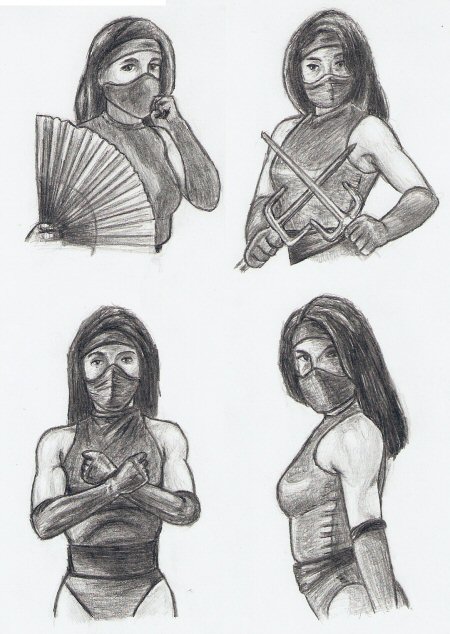
About six months ago, as I looked over the Dark Side of the Soul for material to take a second whack at, the Fighting Game Characters entry struck my fancy. Not only because that render of Juggernaut outright sucked, but also because I feel that exercise was half-assed at best. If you’re going to do a study/exercise/project, go all in (ie, do more than two renders.) So, to answer in the form of this sequel update, I’ve spent quality time with Mortal Kombat’s Kitana in two of her games. So first up, various portraits of Kitana/Mileena (both played by Katalin Zamiar) from Mortal Kombat 2 (the best of the MKs.) All four were drawn on the same page. The top row being Kitana/Mileena’s Vs Screen portraits, the bottom row showing their first Ending Portrait. They were drawn left-to-right, top-to-bottom so I didn’t have to worry about my drawing hand hovering over a previous render and smearing it. (All drawings were done with mechanical pencil on printer paper, by the way.) Originally, I set out to render the portraits exactly; however, upon completion of Kitana in the upper-left corner it occurred to me that the original source material was so heavily Photoshopped (not to mention tiny with a limited palette) that I’d be better off going for a more stylistic look (hence the more deliberate pencil strokes in the shading for the other three.) I’m pleased that all four turned out relatively consistent and close to the same size (on the same sheet of paper, no less.) Beyond that, I’m not too crazy about how any of them turned out, but (again) that has more to do with the limitations of the source material (in Midway’s defense, it was an arcade machine in the early 90s with limited memory ... hence all the palette swap characters.) Next up, a long series of sprites. In Mortal Kombat (and other fighting games) a “sprite” is the individual image files that make up a character’s various movements and, in essence, all of your joystick inputs just trigger the appropriate animation. Now, keep in my mind the game has to store hundreds (maybe thousands) of these things, so sprites are often tiny (like 48X128 pixels tiny) with a limited color palette (a couple hundred at most). Thus, I knew going into this that if I wanted to do a full-sized detailed render I would need to extrapolate a lot. And since I didn’t feel like going there, I opted to keep my sketches fast, simple, line only, and work more on general consistency. It also gave me a chance to work on some more dynamic poses. So, I downloaded all of Kitana’s UMK3 Sprites (this time played by Becky Gable), selected key poses, printed them out, and went from there.
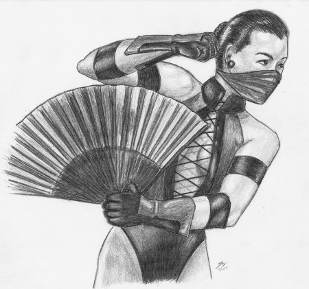
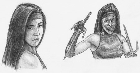
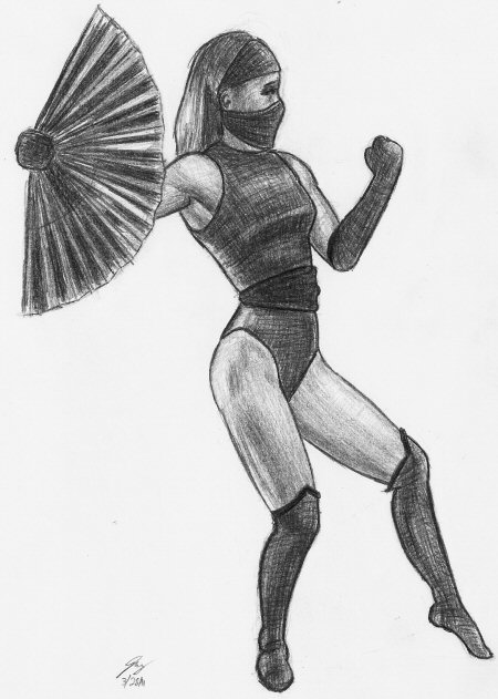
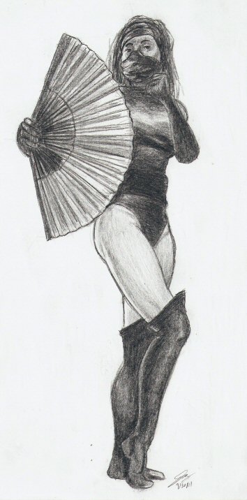
Like before, left-to-right, top-to-bottom (to minimize smearing); about ten-to-fifteen minutes per sprite. For almost all of the poses, I drew a placeholder head first, then would do a glorified stick figure, gauging all proportions back to the original head to, theoretically, keep the figure correct and comparable in size to the other figures. Then I’d go back and add details to the stick figure, and perform minimal cleanups (you can see a number of artifacts of construction lines, especially in her legs and arms where there wasn’t much room to get the eraser.) By and large, I’m happy with the consistency (well, except for the bottom-most sprite on the second page where I went on mental autopilot, completely forgetting the other eight figures on the page, and drew it too small) considering it’s the first time I’ve tried something like this. The hardest part, by far, was looking at the tiny images on the printout and trying to figure out where exactly the blue stripe in her gloves/boots went as often times that black & blue glove/boot fell in shadow. Many times I had to use another sprite where the glove/boot was not in shadow to make a logical estimate. I did at one point consider shading this series; however, in the end, it just didn’t feel right. And it’s not that I felt shading twenty figures would be daunting (they’re so small, it’d go reasonably fast), rather, I felt the shading would take away from them by obscuring some of the tiny line work details. Next, Kitana’s UMK3 Vs screen pose which I drew years ago, and after I laid down the linework for this new version I debated on how to proceed. I seriously considered taking a different approach—leaving it line only in pencil, perhaps inking it, or even coloring it with Prismacolors. In the end, I decided to shade it traditionally, and I’m glad I did because it offers some insight viewing the two side by side: 1. Despite my improvement and the newer render’s superior lines/shapes/forms/shading, it’s clear that the mechanical pencil struggles to keep up with an array of decent art pencils. The old drawing has more natural gradations from darkness to light (particularly in the blacks), and I think the traditional wooden pencils upon even a cheap crappy sketchpad generates a more organic texture to the shading than mechanical pencil on crappy printer paper. 2. You can see how lined or linelessness offers its own unique quality to the drawing. In some ways the old drawing looks a little more realistic (which doesn’t mean it’s necessarily “better”); rather, the lineless quality evokes a sense of realism, for real life does not have thick black lines around objects. The dark and clear lines of the newer render gives it a more “cartoon” look (which, again, isn’t a bad thing; just something to observe.) The former looks more like an old photograph (albeit faded and distorted), and the other looks more like an illustration you’d find in a book. 3. It’s not the tools, rather the artist using them. The newer drawing was done with mechanical pencil on printer paper, and yet the lines and shading are cleaner allowing for more visible detail (like the shadow of the strings cast upon her bare torso), her anatomy (and her fan) is more defined (specifically, the muscle/bone structure of her hands and arms), and overall the pose looks more three-dimensional, more natural, organic, and less stiff than the previous render. I will say a few things about the source image. A. It may be tiny and dark, but I’m almost positive they Photoshopped the fan in because it looks like she’s forming a fist and not holding it. And B. On her raised arm, the highlights on her glove make that really really really look like her thumb even though it’s physically impossible to have the thumb showing in that position. Next up are the Kitana/Mileena’s ending imagery from Mortal Kombat 2. Like the portraits above, the source pictures are tiny with a limited color palette and Photoshopped to hell (especially Mileena with her freaky teeth.) I recall feeling ill the day I drew these two and never was satisfied with how they turned out. I drew Kitana’s features askew, putting her left eye higher than it should be. Also the shading makes her face look flat instead of curved, and something about the way I drew her shoulder makes her neck look unusually thick. I think because in my drawing it looks more like the shoulder is pointed straight out where as in the source it’s actually the backside of her shoulder. Anyway, the Mileena drawing came out much more accurate to the source image (even if I did draw her left eye lower, making her face asymmetrical). It still looks awkward, but that’s because the source looks awkward on account of the heavy Photoshopping they did. Anyway, I feel the details of the muscle and bone structure in her upper body came out well, particularly in regards to the arms joining up with the torso. Moving along, more sprites. This time from Mortal Kombat 2. Same story as above: left-to-right and top-to-bottom. Initially I planned to do two pages of sprites from MK2 to mirror what I’d done with UMK3; however, health issues intervened around this time and kept me from drawing for a month or so, and by the time I bounced back I didn’t have the drive to do another set. I believe I started to, but after getting one or two done I said "screw it" and now I have no idea what happened to that paper. Why did I abandon it? Partly because sprites really aren’t a good source to work from, partly because Kitana’s MK2 outfit is pretty boring being basically a single color one-piece swimsuit with matching gloves/boots, and I was starting to get tired of this project, period. In my search for MK2/UMK3 Kitana related material to draw, I came across an old “Behind the Scenes” article from Video Games magazine with publicity photos of the Mortal Kombat 2 cast both in and out of costume, and I thought “Aha! Maybe this can rekindle my interest in this project.” Heh, no. While the quality of the publicity stills was much better than the in-game graphics (not to mention much larger), they still look like old scans of an older faded magazine so many a details (such as her individual fingers) remained indecipherable. Once again, I tried to combat this with overly stylized shading. Strangely enough, I think her hands came out fine (undetailed as they may be) and the biggest flaw is a misproportioned lower body. I know I’ve blamed the source material a lot in this update, but this is one instance where the fault lies entirely with me. As lacking as the photos are, there’s no excuse for me drawing her legs and hips slightly too small in relation to her upper body. Guilty. Anyway, I’d been doing a lot of experimenting with shading (crosshatching in particular) and I really like that look the deliberate pencil strokes gave this drawing (especially the contrast between the texture on her outfit with her skin and hair.) I’m also very pleased with the number of anatomical details that came through with the shading (most notably the shadows resulting from the muscle/bone structure in her hips and legs; I also liked how her arms, shoulders, and upper body came out.) If you look closely at the bottom, you can see the date as March 28, 2011. Soon after, I began suffering from perpetual headaches which made concentrating difficult. At the time I wanted to (eventually) come back and finish that second page of MK2 sprites and there was (at least) one other publicity photo I wanted to tackle, but the headaches went on for a month and when they finally went away I really didn’t want to return to this project. But at the same time I felt obligated to come back. I’d already completed 85-90% of the drawings in the series, I’d already scanned all those drawings in, I had started building this page, and I had written roughly the first half of the commentary—I had to finish it. It would drive me bonkers not finishing it; however I could still put it off. Ah, my good friend, procrastination. And it became a weird cycle of me sitting down to draw, searching for a subject, briefly considering the final Kitana drawing, and quickly dismissing it. Six months this went on—not really haunting me. No, more like “nagging.” And don’t ask why I didn’t just scrap the last planned drawing and publish this update with its existing eight pages and thirty-eight individual renders of Kitana. Apparently, that wasn’t enough but nine pages and thirty-nine renders apparently was ...? Don’t ask. I’m stupid.
Anyway, almost six months later to the day, I finally sat down to draw the last image and I think it shows that I just wanted to get it done. The funny thing was I was actually enthused to be finishing up this project, that is, until I started looking deeper and deeper at the source photo for details that weren’t there. I put up three different versions of the photo on the screen: the first, untouched to serve as a base reference; the second, brightness raised to make it easier seeing into the dark shadows (the boots and glove in particular were difficult to make out); and the third, contrast raised to once again try and make sense of and define the shadowy areas. Looking at this final render, it really had potential to be the best in this series, which would have been an appropriate ending to show the progress I’d made (especially since it came six months later.) Its biggest flaw is the uncomfortable mix of care and sloppiness. In terms of shapes and proportions, I think it outshines any other render on this page. I was very careful to get that right, doing two blind studies (silhouette and detailed) for warm ups, then for the drawing proper I constructed Kitana’s figure out of first very simple placeholder shapes and slowly, gradually, and methodically, adding more and more detail. But, unfortunately, as time wore on, I grew more and more tired of the image and put forth less and less focus. The end result? Well, look at the lines. Look at the shading. There’s no sense of consistent stylization evident in pretty much any other drawing discussed above. Instead, it has an “I want to get this done and I don’t care how” sloppiness to it. And worse, it doesn’t have the spontaneity or energy of a quick, loose, and rough sketch which inherently is riddled with small flaws but at least has a cohesive and consistent look to it. Instead, this drawing has a sloppy finish to a careful and calculated start which just looks awkward. Anyway, back in late February/early March of 2011 when I really committed to the idea of revisiting older Dark Side drawings and updating them, I had an extended plan of first revisiting Kitana and then eventually doing a followup with Juggernaut (because it bears repeating that the first take flat out sucks.) Six months later, I can now tell you it’ll be a cold day in hell before I revisit old fighting game sprites/in-game graphics again. I still like the idea of revisiting old Dark Side drawings, and I still plan on following through with that idea ... just not these Dark Side drawings.
—Jay Wilson Three Years Earlier: Fighting Game Characters, Take One |
|
|

