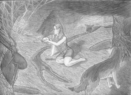
 Shadows of a Pearl This too was drawn while I was taking a design course in college—when I learned about the placement of focal points and design rhythms. It’s easily superior to all of the drawings that came before it (most of which do not appear on this site, and probably never will) for the simple fact that for the first time I had control of the frame. So, here’s one of my first artistic outings where I set out to consciously compose an image utilizing elements throughout the entire frame. The eye follows the girl to the triangle shaped tree in the background, which points to the spiderweb, which arcs along the left side of the frame and points to the wolf who, in turn, looks on, leading the viewer’s eye back to the girl. Being my first attempt to control the frame, though, its structure feels terribly contrived due to the lack of subtlety (the spiderweb is back! even though it clearly doesn’t belong, a unnaturally placed and unnaturally thin stream of water—yeah, that’s what that’s supposed to be—and an awkwardly placed wolf.) I think part of the problem lay in the fact that at the time (and even today) I struggle with capturing a sense of depth. Here I wanted to make her feel like she occupies space in the background, and in many regards I believe I succeeded although I’m not entirely happy with the rendering of said background—it’s too flat. I still had not mastered realistic shading (or even artistic shading). Still using paint-by-the-numbers flat shading instead of the more realistic dynamic shading. I think the culprit is two-fold here—still drawing via mechanical pencil (which doesn’t get very dark) and the fact I learned that distant objects are rendered lighter while closer objects are rendered darker. The result? A virtual monotone in shading—every element gets its own value, and there’s no blending or bleeding of one object into another via shadows. I had learned one thing by this point though: texture (the most successful aspect of the drawings.) Tree bark looks rough, the wolf looks like he has fur, strands of grass are visible, the spider looks slick, and, more importantly, the pencil strokes help guide the eye through the image on a more discreet level than, say, the misplaced spider and his web. I still had a ways to go with it, don’t get me wrong, but I think the progress is visible. |
|
|
