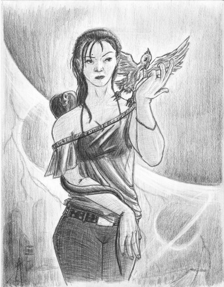
 The Shadow Enchantress Originally I was just going to work on drawing facial expressions, and work on consistency of drawing the same face repeatedly to help prepare myself for eventually illustrating a graphic novel. However, the first one in the series turned out so well that I decided to instead do a full blown drawing off from it. So, needless to say, completely unplanned. Completely spontaneous. But, unlike a lot of my other spontaneous drawings which are heavily flawed yet “good for a ‘spur of the moment/no reference doodle’”, I think this one is pretty damn good even for a planned/reference-heavy drawing. It was surprisingly modular in its execution. Her face came first with all the details but the hair and shading completed. Then came her body/clothing (For those who aren’t artists, when drawing from scratch we usually do a rough bare-bones figure drawing first to figure out how clothes will fold and drape.) When I had her more or less completely shaded (except for the translucent top), I looked over the image, and it dawned on me that her pose seemed awkward ... like she was gesturing to things that weren’t present in the drawing. That’s when I added her two familiars (the bird and the snake), again drawing on top of a finished figure, and the two additions did, indeed, complete the pose. With her and her animal companions fully rendered (including the translucent top), it came time to add a background ... ... because if you’re going to draw a graphic novel, that’s one of the things you’ll have to do. Initially, it was just going to be a gray gradient to subtly imply a lamp post above and behind her [explaining why the highlights are on her left (frame right)]. No discernable details because I couldn’t picture any backdrop that would fit due to her size and position in frame. Then I took a cue from my handful of abstract drawings, and started to add shapes, lines, and shades that felt pleasing. The first being the large arc, which prompted me to give it sphere shading and erase a streak right next to the darkest line. Viola, a planet. So I added two smaller planets strictly to balance the frame, aid the flow, and give the image a sense of depth. Next, going back to abstract imagery, I felt the bottum of the frame needed darker values. While shading, I inadvertently laid down dark rectangular patch which implied a building. And so, the architecture in the lower tenth of the frame came into being. Lastly, while touching up the backdrop, erasing strategic streaks to give the planets a slight glow from their atmospheres (that, and for plain and simple contrast reasons), I got the idea to add black lightning as a counterpoint to the white Saturn-like rings around the lower-right planet. I think me (finally) drawing consistently can be vividly seen in the Dark Side of the Soul renders. From Figure Study IV on, the poses are more dynamic, more weighted, more nuanced, and more ambitious. And here is no exception. There’s subtle details in the pose like one shoulder being lower than the other implying that her weight is on one foot, both arms are reaching forward which pushes her breasts together, the translucent shirt and dark bikini top underneath, the fact most of her is actually in shadow except for a sliver of light on her left (frame right), and the natural simplicity of her hair (I always seem to overdo/underdo the hair.) The background is far more dynamic and far more complex with the planets dramatically sweeping the focus from one side of the frame to the other. There’s a more fun energetic zig-zag of angles where most of my stuff seems perpetually stuck in 45°s (Thank you, abstract drawings.) The bottom of the frame is busy with architecture, lightning, and planets which gives the simplicity of the top half of the frame, occupied solely by the Enchantress, more power. The initial grey-gradient gives the buildings and planets the illusion of atmospheric depth. And the interplay of white and black silhouettes, using of the eraser to draw, makes this background look foreign to anything I’ve done before. Is it perfect? Of course not (I drew it, for one.) Upon close inspection, it becomes apparent the various elements were drawn isolated from one another. After I had already dedicated the snake to its position peaking over her shoulder, I realized part of its body should be resting on her shoulder. I overdid the folds in the translucent top, and I drew her hands at generic angles (for me, anyway.) The element that bothers me most, though, is her right hand which I intended for her to be seductively sliding up her left hip, fingers fanned out; after dedicating the lines, it finally occurred to me her wrist would be elevated (creating a kind of ”wave“, from her forearm which would be close to her abdomen, her wrist would rise up away from her body, and her fingers which would arc back down to her.) Despite the flaws, I think she looks badass which makes up for what I did to this poor girl, so now I can do another misogynistic drawing—err ... umm ... I mean—never mind. |
|
|
