|
Around March I could feel drawing burnout creeping up on me. Just suddenly out of the blue I didn’t have interest in drawing anymore. I’d put down a few lines and simply could not focus (and anything I tried clearly showed the lack of interest.) So I decided I would drastically reduce the amount of time I spent drawing—all but a bare minimum to (hopefully) keep atrophy at bay. So at least once a week I would sit down and force myself to spend an hour drawing ... and it wasn’t pretty. But, then again, that wasn’t the point either. It actually was a pretty productive phase of my life—taking in some excellent films (rent The Wages of Fear), penning seven reviews, DMing a 4th Edition Dungeons & Dragons game, putting together three videos among several other projects—pretty much everything except drawing. 
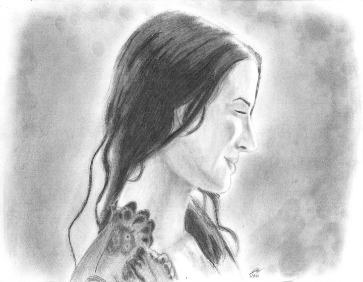
Asia Argento as Violaine (Les Morsures de l’Aube) And slowly but surely, towards the end of May the drive to sit down with my pencil came back, and I found myself able to get further and further along before getting bored and giving up. I had to work out some cobwebs and shake off a bit of rust, but I think those modest efforts to consistently draw whether I wanted to or not kept it to a minimum. The three drawings here, I feel, represent a full blown return to form. The first is Italian actress Asia Aria Maria Vittoria Rossa Argento from a French movie called Les Morsures de l’Aube. I went with this screen cap because I have a very strong preference for straight on or three-quarter to the point that it hurts my attempts to draw profile. So, yeah, I need the practice. I honestly thought I was done with the painting-like look of heavy blending, but when shading time came around I found myself looking at the source thinking, “you know, this shot kinda looks like something you’d see in a painting.” So there you go. This time around I wanted to minimize the pencil strokes as much as possible, so I scribbled down graphite on another sheet of paper, loaded it up on a makeshift tortillion (a sheet of paper rolled up with tissue wrapped around the tip), and I transferred it that way. The exceptions, of course, being the darkest regions for obvious reasons and also her nightgown because I wanted a little bit of texture for the fabric. Also I got tired of all my background-less drawings, so here I went with the absolute laziest possible alternative—shading in the white negative space and making it a nebulous grey negative space, created once again by scribbling a ton of dark graphite onto a separate sheet of paper and using my thumb wrapped in a tissue to paint it into the back ground. Finally, all this graphite smearing wiped out all my highlights, so I had to go back in and pull them up with an eraser, then blend around the edges to create a smoother gradient from dark to light regions. In this particular scene, the character Violaine radiates with a sense of newfound life, happiness, and meaning standing in front of a window through which the audience can see the city beyond. And even though I opted out of drawing the background, and even though it has its share of minor issues, I think it’s a very fair likeness and captures much of that radiance. 
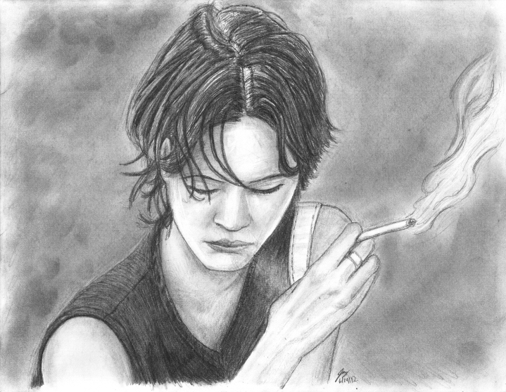
Asia Argento as Cora (Compagna di Viaggio) So, now I’m done with this style, right? It’s kinda neat, I kinda like it, but it’s not really me. Now I’ve played around with it, picked up a few new tricks, I can go back to my style, right? Wrong! ... sorta. About a week later I’m drawing from another European movie Compagna di Viaggio also starring Asia Argento. And anyone who has read these commentaries can probably guess what attracted me to this particular screen grab (and those who haven’t can probably still guess.) Anyway, while I still used very heavy blending, I went for more of a hybrid look with much more pronounced pencil strokes in the fabric and her hair while reserving the smoothness of blending for her skin. And I have to say I much prefer this style with the varied techniques and visible lines which gives it a more dynamic—more alive—feel as opposed to the lineless (which is more realistic) more singular (static) technique of shading demonstrated in the Violaine render above. The drawing has its problems. Her shoulders sweep at too steep an angle, her left arm (right of frame) comes in too much, there's some minor issues with the shape and alignment of her features, but I think they look more like deliberate artistic exaggerations than mistakes (they are mistakes, and I wish I didn’t make them ... I just don’t think they’re as obvious as stuff I've done in the past.) Despite all that, I’m probably least satisfied with the stream of smoke she’s exhaling which looks more like an inexplicable light patch on her top and not a stream of smoke (especially given the graphic novel smoke trail coming off her cigarette.) On the flip side, I particularly like how the pose, the cigarette, and the smoke coupled with with the black and white palette and ambiguous backdrop make it look like a scene out of film noir. And even though my render has a whole different tone than the scene in the movie and even though a number of details are off in my drawing, I think it still accurately captures the emotion of the character. 
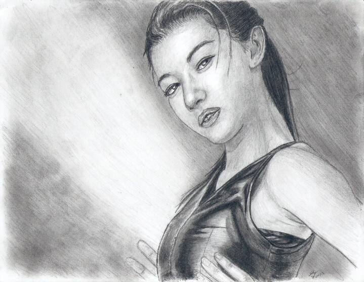
Gianna Jun (Actress) Okay, so now I’m done with this blending overkill phase, right? Well ... lastly I have Gianna Jun, whom I drew previously. This one is not from a movie, rather just an image I located with Google and added to my ever growing digital reference library. What actually attracted me to drawing it is actually a failed doodle I’d done the previous week when I had no references handy. In that doodle, I drew a girl with her shoulder drawn up, and I simply didn’t know how to pull it off from that angle. Then I found this photograph which is not the same pose, nor the same angle, but I couldn’t help but notice how pronounced and developed her neck and shoulders were. So I picked it out to draw as a way to make ammends for my butchered doodle which will not be appearing in my Portfolio here on Dark Side of the Soul. Originally, I did some preliminary shading and very very heavily blended that first wave. Interestingly, her shiny black top didn’t get much attention initially because the sheer range of values (it has some of the lightest areas and the darkest). I didn’t want to risk unintentionally smearing the graphite with my hand or having to do too much corrective work with the eraser which could easily screw up a lot of careful work. So I very conservatively shaded the darkest regions of the top and some of the medium-dark regions, erring on the side of caution so it honestly looked like a spiderweb pattern with ultra-thick lines. I carefully blended that, again erring on the side of caution with much greater light regions than what was in the source. It kinda looked washed out at that phase, but we’ll come back to that. Now blending tends to require touchups since you’re transferring (smearing) graphite from one region to another. Light regions become darker, and dark regions become lighter. Sometimes you overdo it and have to go back to restore values where they should be. On top of that, I tend to make multiple passes at shading anyway. So after that first phase, I have a nice base that looks smooth and polished thanks to the blending, and I decided on top of that base I would apply additional layers of shading whose strokes I could vary with the pencil itself (as seen in her hair as opposed to her top or her skin) and I would not have to screw with further blending. The end result, I really like a lot for the same reason given in my render of Sir Alfred Hitchcock, “because it doesn’t look like my style.” Not just this drawing of Gianna Jun, but all three drawings presented here. And I’ve mentioned before how more and more I feel like I have less and less to say about my drawings—that I feel the more I grow as an artist, the more my work says on its own without me needing to give a commentary. It’s put me in a strange place with this set of drawings because by themselves I don’t feel like I have much to say about any of them (which, these days, more or less dictates what makes the Dark Side cut), but together they do give me something to talk about. I’ve done a handful of other drawings that I’m pleased with over the last month, but these three represent key points in an overall arc where I experimented with a technique in its purist form and gradually worked back to my style, trying to find a comfortable place to incorporate the elements of that which I’ve learned. Creating a hybrid, and evolving my own style. The individual points along the arc may not be very interesting nor worth talking about, but the overall arc, itself ... that just might be a different story.
—Jay Wilson |
|
|
