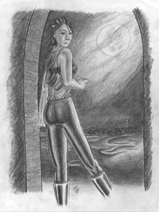
 Nissa I spent approximately a month without picking up my pencil, and what happens? When I go back to my art form, it yields my usual static and generic crap (which I’ve opted not to upload. You’re welcome.) Once again I decided on a boredom doodle to warm up! So I popped in Last House on the Left (a film which I consider unviewable), and listened to the commentary track while doing the line work for this drawing (what can I say? I’m addicted to special features—I won’t watch the film again, but I’ll listen to the creators talk about it ... but that’s another story.) And before you ask: No, Last House has nothing to do with the inspiration for this drawing. The sketch is something of a paradox for me: on one hand I really don’t think it’s very good, yet I’m still pretty happy with it. More specifically: I’m happy with a few isolated elements, but disappointed with the image as a whole. I wanted to escape my generic clichés that I fall back on like clockwork: I wanted to draw a more unique face. Usually I’d use a real life source for inspiration, but I had a pretty clear idea of what I wanted (though in retrospect, a live source still would have made things better, easier, and more effective.) Her pose and outfit were developed on the spot (pretty obvious, non?) I wanted her top to have a subtle translucent quality to it, but unfortunately, that’s not an effect that I’ve gone after very often. While drawing it, I was deathly afraid of making her shirt opaque, so, of course, now it’s too transparent. The line work for the girl was done with a mechanical pencil (didn’t have art supplies around at the time; however, for the shading later on I did get a hold of a 4B. Anyway, Nissa was drawn entirely (shading and all) without a background. The background came as an after thought. I’ve done so many background-less drawings, I just didn’t want to add to the pile because such abuse of negative space was starting to bother me. To make things worse, I didn’t want to throw together a background that obviously doesn’t belong (the Noria, for example). I wanted the background and foreground to match one another, to be appropriate for one another, and Nissa had to look like she occupied space in the background. One reason the background and foreground should be developed together is because people realistically interact with their surroundings—we influence our surroundings, and our surroundings influence us. Having already drawn Nissa, my options were limited. I had about given up when the idea for an archway hit me. Unlike Nissa, the background was drawn from the ground up with the woodless 4B pencil. Like Nissa, the background was invented on the spot as I got to it, “Okay, we’ve got an archway ... what do we see through it? How ‘bout a seascape?” Ultimately, the background is a composite of memorable images that stuck out in my mind. I think I was able to effectively do more with the background as far as subtlety, texture, and details go. If you ask me, the background outshines the drawing’s subject. The end result is a drawing with a misaligned focal point, a flow that follows her legs down and off the page entirely, an unnatural pose, and a plethora of subtle (and not so subtle) screw ups on my part. But, there is some nice shading on the boots. |
|
|
