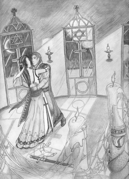
 Moonlight Dance When I took a design course in college, my drawings became far more ambitious than anything I’d done before. “Oh, so that’s how I was supposed to be doing this all along!” You know, stuff I would have learned had I bothered to take art classes in High School. Later on I would learn to drop that damn mechanical pencil, but at the time I was too stupid to know better. This was actually drawn on a piece of scrap plotter paper (lots of scrap paper that would otherwise be thrown away—one of the perks of being a drafter.) Here I had not one but two figures in the frame (usually I would only shoot for one), interacting with one another (take the potential for screw ups and increase it by the power of four), and occupying space in the background (that’s it, game over.) I can really nit-pick the subtle details I botched such as the fact they seem to lean to the left for no apparent reason, the fact they have no visible weight, and their awkward embrace (his left arm really should be on her waist, and much less of his right arm should be visible) but hey, this was done purely from my imagination. No models. No examples. No guides. Pure imagination baby, and first try at that. All things considered, I think I did pretty damn good. Less successful aspects: at this point in my studies I’d learned about guiding the viewer’s eye through the composition, and I did okay there—the candles lead up to the windows, the light from the windows lead back to the dancers, the sword and sash on the ground combined with the spiderwebs lead back to the candles to complete the circle. A little contrived, yes, but I was learning. One glaring flaw: I drew an imbalanced picture, one that’s heavy on the left (attributed to my lack of knowledge regarding where to place a focal point in asymmetrical frame yet). The two figures need to move a few steps to the right. Anyway, I really liked the candles in the foreground (even with the oddly placed spiderweb) and the candles on the far wall (and the light the cast there.) I like the sword and sash lying on the ground—they really look like they’re weighted and actually occupying space in the image. I’m proud of the outfit design for both characters, particularly her dress (even if the sleeveless look would become a common motif in my drawings) and the designs in his cape. I was also happy with the tree line seen through the windows, although I’m less thrilled about the windows themselves (please ignore the illogical shadows they cast on the floor.) Overall, a successful step in the evolution of my drawings. |
|
|
