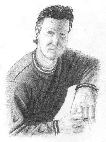
 Marco Beltrami (Composer) So now we have more than a headshot! More than just someone standing there smiling! I found a picture of composer Marco Beltrami with his arm resting on his piano (which I opted not to draw for the sake of simplicity). I really like this picture; it shows his hands in the frame, and overall I think the pose is pretty cool in a casual kind of way. Oh yeah, and my favorite lighting scheme with shadows down the center of his face. Gotta love it! I have a tendency of drawing the human form like some type of animated armor where every section is one stiff, unmoving, unit. I struggle to capture the body’s range of flexibility (especially in the torso) in certain poses from certain angles. The pose (and angle) doesn’t necessarily have to be dynamic per se, sometimes a person simply leaning casually is more difficult than an exotic stance. While the torso’s ability to change its shape is subtle in comparison to the hands, it’s still there and important—the back can arch or bend forwards, it can lean left or right, the shoulders can be pushed back or brought forward, they can be drawn up, etc. That subtlety is the difference between someone just casually there and relaxed versus looking mechanical and tense (and no, overlaying clothing doesn’t hide it either). I wanted to tackle this image because in the photo one shoulder is dropped and the other is raised, but at the same time both are at rest. Also, the slightly higher angle looking down so the top of his right shoulder (in frame left) is visible—that angle typically gives me trouble. Mistakes—my recurring theme of elongating the face came back (just when I thought I was cured). The other major screw up? Misgauging the scale of his hands since roughly half of them are out of frame. Drawing things partially out of frame proves very tricky in getting proportions and placement correct (remember, all things are relative ... and when a lot of the relative elements are missing there’s fewer items to compare it against.) On the flip side, I thought I did pretty damn good with the shape of the hands. Check out the details of the underlying anatomy (veins, bones, etc). I was so happy, I wanted to make ‘em bigger so everyone can see! Yeah, that’s my excuse. Once again, an article of clothing took longer to render than the rest of the subject. Speaking of the sweater, this is one of the few times when the scan actually looks better than the original. On paper, the shading on the sweater looks very sloppy. |
|
|
