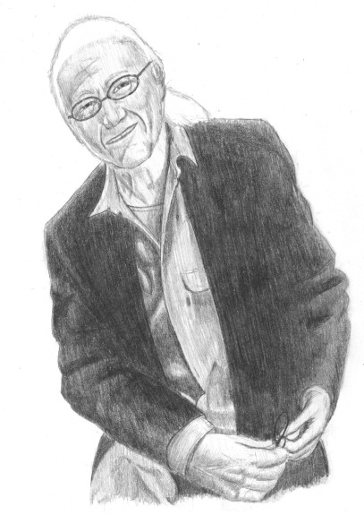
 Jerry Goldsmith (Composer) One of my all time favorite film composers, a legend within the industry, the late Jerry Goldsmith. I actually went back to a CD booklet to draw this (the photo was, mercifully, much larger to draw from), specifically the Patton score featuring a few tracks from Tora! Tora! Tora!. The photo I drew from was originally in B&W, and as my drawing developed I had to cross reference with a color photograph from IMDb since some of the lighting highlight were indistinguishable with his white hair. I selected the picture because it showed more than just a headshot—he’s sitting on a stool (although in my render that’s somewhat lost) with his hands in frame, keyboards and synthesizers in the background (someone shoot me for once again not rendering those.) With this picture, I started approaching these portraits (somewhat) correctly in artistic terms since the goal of any decent artist is not to render their subject exactly. It’s an artist’s job to enhance the image, better clarify (or obscure depending on the drawing) individual elements, to take advantage of the medium’s strengths and weaknesses, and to develop focal points. I feel that I handled age much much better here than with the render of Stan Winston, and here I didn’t make the mistake of over-exaggerating features and lines. Of course, Mr. Goldsmith’s expression here is less of an extreme as Mr. Winston’s. That, no doubt, made things easier. Anyway, here I let things play out more with subtlety. There’s very little difference in facial expression—simply darkening a line around the eye can change the whole tone of an expression (note: you don’t have to add anything new. Just minor adjustments to what’s already there can make a major impact.) Human beings are considered difficult to draw because we’ve seen and dealt with each other all our lives. We’re unconsciously very receptive to those subtle differences. But to render it, one has to become conscious aware of the differences—darkening one light slightly, drawing another with a slight curve, etc. I’m not entirely pleased with its resemblance to Mr. Goldsmith (especially stacking the source and my render side-by-side), although I’m still very proud of the shading and how some features came out. Now if only I could be more precise ... |
|
|
