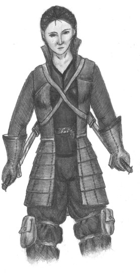
 D&D Rogue I initially set out to render Norwyn with this. Usually an artist precedes a true render with a series of rough sketches to work out elements of the image in their mind, to experiment with some possibilities, and to smooth out some of the detailed decisions in advance. I didn’t do that. I wanted to draw her in leather armor, but the problem is I hate drawing armor (I really don’t like drawing swords either.) The examples illustrated in the D&D Player’s Handbook didn’t look right, so I tried to design something that looked very very different. What I came up with looked more 20th century—military fatigues meets a women’s 3/4 leather jackets? Whatever. It didn’t look like it belonged in Faerun. From there, I tried adding additional details (such as the layered effect to the jacket below the waistline) to make it feel more Medieval-ish, but that did not accomplish very much. Now it looks like a weird hybrid. Then I abandoned all attempts of making it a render of Norwyn, and decided to just keep working with what I had (because I kinda liked the image—I liked her face despite the symmetry issues, and (jacket aside) I liked that outfit—it just wasn’t appropriate for Faerun or the character.) I really should have come up with an alternate title for the drawing since what I intended and what it became were two different things. Oh well, them the breaks. On the flip side of the coin: I needed to draw the straps to her scabbards straighter. Their weight and the swords’ weight would put more tension on them, but they look loose and weightless as I’ve rendered them. I’m not fond of the swords, themselves, but I won’t go there. The other thing that bothers me isn’t necessarily my screw up (Yay!); her hair is pulled back into a ponytail; however, from this view it’s hidden. I thought about how to show it, but I never could come up with a way besides the cheesy “I’ll throw it over her shoulder despite there being no reason for her to do that.” See, this is why true renders are preceded by sketches—so we can figure these things out in advanced and come up with a new pose. Technique wise: I tried a hybrid of styles (visible pencil strokes meets smooth blending) to create a different type of texture, and (the jacket aside) I’m happy with how that turned out—the gloves, the top, the pants, and her skin came out pretty well. I also took an eraser to the image to accentuate the highlights, which I rarely do. Her outfit could benefit from a greater range in values, deeper shadows and more highlights, but now I’m just getting nit-picky, and besides ... it’s a marked improvement over some of its predecessors. |
|
|
