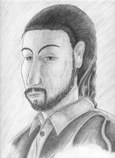
 Dante Dante, like many renders on this site, was drawn as a means to get back into illustrating after a six-month hiatus, and so it was relatively simple in design. Despite the simplicity, it’s still littered with proportion mistakes (elongated nose, face, misaligned eyes), my typical personal cliché of making people look generic, and not enough contrast between the light and shadows. Right now it looks like a halfhearted portrait of a nobleman, rendered by a hack artist. At least it’s a completed halfhearted portrait of a nobleman, rendered by a hack artist. Also, I think the shades are too distinct, too defined, and too crisp. And while it is nice being able to instantaneously distinguish between the different fabrics, the skin, the hair—all just by observing the tone of the shading alone; however, in a drawings with visible lines, it’s overkill. Plain and simple. Reality reduced to black and white doesn’t have that vivid and obvious a distinction. Besides, part of the fun of art is when you (carefully) blur the degrees of shading so that it’s not obvious where the shirt ends and where the skin begins. It’s not necessary to have that crisp divisor between the different elements of the drawing, and looking back there’s a whole aspect of darkness that I’ve really not tapped into or explored in my drawings (at least the illustrations.) The more I think about it, the more I’d like to experiment with it. |
|
|
