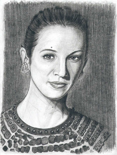
Asia Aria Maria Vittoria Rossa Argento (Actress) For about a week, this drawing was the bane of my existence. Let me explain: I've drawn quite extensively from imagination for a friend's project (a mini-comic book that ... turned out not to be so mini, but never mind.) Then one Thursday afternoon, setting aside my growing stack of papers, I realized I hadn't really drawn from a source in awhile (I kinda had for general pose ideas, but not this kind of source drawing.) So I thought I'd take a short break and do a quick and dirty sketch. Thus, I hunted up a photo of the always attractive Asia Argento, put my pencil to the paper, and didn't really care how it'd turn out. After all, it was just a throwaway side project to change things up, right? Heh, well from the speed of the drawing, I had some issues with the line work, but I looked at it and thought, "hey, this looks pretty good ... with a few tweaks, I can fix it" and thus began the long and painful series of reversals: I wasn't going to shade it, but, "man, it would look even better shaded!" I didn't like her dress, so I wasn't going to draw anything below her neck—hell, I didn't even finish drawing her neck—but as the shading on her face came together I couldn't leave half the drawing line-only; that would make it look lazy, sloppy, rushed, and it deserved better. So then I decided I just wouldn't draw the dress; I'd put her in a t-shirt or some other dress, and no one would know because I wouldn't show them the source image! ... but "God damn it, this site is littered with drawings where I backed down from drawing intimidating time-consuming details. Fine! FINE! I'll draw the stupid dress!" As a result, this one was done in three stages: face, neck, and dress—each stage nearing completion before even beginning work on the next. An unusual process which I do not recommend, for when an artist isolates elements and works on them exclusively, he runs the risk of rendering said elements so that they just don't seem to gel together into one seamless and cohesive unit. It usually ends up looking like three separate parts that don't quite fit together; however, I think this drawing transcends its process and avoids that particular pitfall. It has a few issues and no doubt some of them arise from the flawed method in which it was drawn, but I think all three individual pieces feel properly integrated into the whole. I tend to draw people with their hair down, so for this round I looked for a source with the hair pulled back. When I found this image of Mrs. Argento with the dark shadow along the left side of her face and pitch black backdrop, I couldn't resist. No direct warm ups (I did, however, literally just set aside one drawing to begin work on this one so I didn't start cold either). I worked off several copies of the same photograph. One in color, untouched, which I used for the early line work. The second, I reduced to grey scale and used for the vast bulk of the shading. The third, I reduced to grey scale with the brightness brought up dramatically to make better sense of the shadows. I'm most proud of the wide range of values with a very nice juxtaposition of light and dark areas. I'm also very proud of the texture: her skin looks soft, her eyes sparkle, the chrome studs reflect light, and the "flakes" on her dress look leathery. This drawing comes back to my typical style with more pronounced pencil-strokes although early on I did heavily blend some very very light shading to serve as a base which is more or less how I use it these days; I think it helps tremendously capturing the smoothness of flesh and glossiness of metal. I considered rendering the background with heavy 'cloud-like' blending to really mix up the look, but in the end, I feel I didn't have to. It already looks different, more mature, than past renders even if I use the techniques frequently. So, prominent pencil strokes in the background felt like the right decision. My renders still have problems preventing them from entering the realm of photorealism. I still have minor issues with shape, alignment of features, and subtleties of expression. But, man, they're a hell of a lot better than they were once upon a time.
—Jay Wilson |
|
|
